
HERE Platform Launcher
Card Sort to Inform Information Architecture Redesign
As the HERE Platform grew, with more and more features being added, the primary navigation became overloaded and difficult for users to navigate.
In this study, I worked with the design and product teams across the Platform to better understand how users understood the items in the navigation and how that might translate into a more usable information architecture for the Platform.

overview
HERE Platform is a cloud platform that allows users to bring and work with location data, combining and transforming it to develop solutions for their own use cases.
As the platform grew, more and more things were added to the top level navigation, organized within a launcher. This top level navigation eventually became overwhelmingly long, and so we decided to do research to figure out how to improve the information architecture and make it easier for users to parse and find what they needed.
In addition to reorganization, we hoped to gain insight into what inclusion criteria users would want to use if they were presented with a shortcut list of microservices.
Team
Ashley Callaway, UX Research
Method
Remote Moderated Usability Testing
Outcome
Although the full recommended changes to the IA were slow to be implemented, the research allowed for a reduction in items in the launcher and later informed the addition of new features and microservices to the Platform.
What is the Design Problem?
As new features moved to the HERE Platform, everything was placed in the main navigation, which over time became too large to be easily navigable.
Reworking the information architecture of the Platform would require collaboration by many different feature owners, so research was needed to help guide these conversations.
Who are the users?
Every user on the Platform uses the launcher, so this project had the broadest user group- anyone who might be using the Platform UI- including users from product teams, sales teams, developers, data engineers and data scientists.
methodology
These were unmoderated, open card sorting sessions conducted through OptimalSort.
An open card sort asks the participants to both group the cards however makes best sense to them, as well as asking them to create names for the groupings. This method is best when trying to come up with an organizational structure, because the names participants come up with offer additional insights into why they were grouped in that particular manner. We also didn’t have the luxury of running moderated card sorts, so this allowed at least a bit of visibility into the participants train of thought.
For this test, I limited the cards to 30 because keeping the number of cards low reduces fatigue for participants. With moderated tests (where you are there with users and can debrief with them on why they made their choices), they are less likely to just throw cards in random categories to be done with the test. As these sessions would be unmoderated, the goal was to prevent this noise causing errors in the data. 30 felt like a good balance between introducing fatigue and including enough cards to adequately cover potential items in the information architecture.
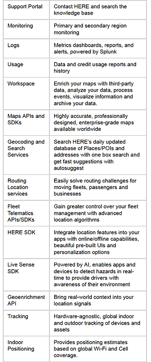
The participants were given the list of 30 cards- which included a short description of the item- and asked to group them into whatever categories made the most sense to them.
In creating the card names and labels, I took care to ensure that wording was varied- oftentimes if users see the same word on two cards, they’ll group them automatically without giving deeper thought to their content. Mixing up the language forces users to stop and think a bit more (although does require a bit more consultation with stakeholders in deciding on the correct wording).
In addition to the card sort, afterwards participants were also asked to select a subset from the full list of cards that they would want as a subset as a shortcut, as well as their criteria for selecting that subset (ex. Frequency of use, recently used).
Research Goal
Learn what grouping of HERE’s microservices on the platform best fits users’ understanding of these products. Additionally, we want to understand how to best present a subset of these to users to make it easier to find the products they want.
Primary Research Questions:
-
What items do users think of being grouped? How do users label groupings?
-
How many groups do users prefer?
-
How does this differ between users?
Secondary Research Questions:
-
How would users prefer to be presented a subset of the products?
-
What would be in this subset?
-
How would they expect this to be determined?
-
Do they expect to be able to control what is shown?


Sampling of cards, with descriptions
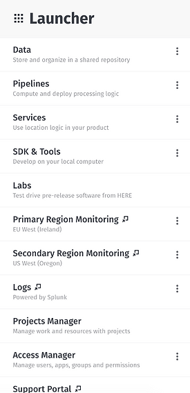
(Part of) the Platform Launcher
When creating cards for the card sort, it was important to try avoiding word repetition, since participants can just recognize the same words and group these by default instead of thinking deeper about their meaning.
analysis & outcome
Typically, 20-30 participants gives good results, and we were able to get 21 participants. The participants were asked their familiarity with the HERE Platform, which ranged from slightly familiar to extremely familiar (participants with no familiarity were screened out). They were also asked their role at HERE, with a slight majority being developers followed by those on the product side of things).
Analysis was done using three different methods supported by the OptimalSort software.
The similarity matrix shows the proportion of users who grouped any two cards together- so for example “Logs” and “Monitoring” were grouped together by 85% of users, which highly suggests that those two items should be in a category together in the IA.

A dendrogram shows the proportion of users who grouped a particular selection of cards together, for example, “HERE Style Editor,” “Map Creator,” and “Studio” were grouped together in the same category by 67% of users, suggesting that these might be a good fit to group together, but we’d probably want to back that up with other evidence as well.

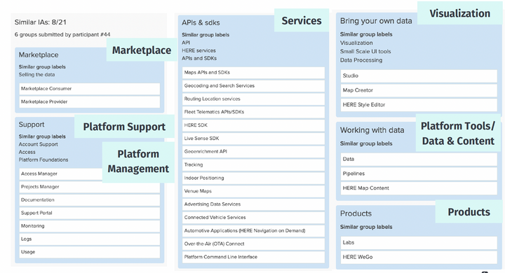
Participant centric analysis looks more holistically at a participant’s responses, and then compares them to each other to find trends in who came up with similar architectures and categories. This is a really useful tool offered by OptimalSort because certain users might be more inclined to group things together than another type of user. An example from this card sort shows that 8 of the 21 participants created a similar IA to a particular participant who created 6 categories, Marketplace, Support, Platform Management, Services, Visualization, Tools & Data, and Products.

Based on the data from these analyses, I suggested the following IA as a starting point in reorganizing the content in the HERE Platform launcher.
Results were presented to stakeholders in two separate sharing sessions- one for direct stakeholders on the services team, with time to discuss and triage findings, and another for the wider Platform team with a shorter Q&A at the end.
Results were presented to stakeholders in two separate sharing sessions- one for direct stakeholders on the services team, with time to discuss and triage findings, and another for the wider Platform team with a shorter Q&A at the end.
The outcome of the research was ultimately not a full rework of the IA- some of the recommendations were implemented, but ultimately progress towards a complete rework of where different features and microservices sat within the platform was stalled as other projects were prioritized instead. The research was referenced as new features were added to the Platform, so it was useful in guiding future organization strategy.
.png)